Optimizing Date Fields on Forms
We examine the best UX patterns for date questions on forms
What is the best UX pattern for date questions on forms?
This article is part of a series on optimizing individual form fields. You can read other articles in the series at the links below.
Optimizing the phone number field
Date fields are easy aren’t they? Just three little bits of information - a day, month and year. Hard to get wrong.
Not quite. Date fields are more nuanced than you might think and are heavily dependent on context; asking for a date of birth should be done differently than booking the start date for a future holiday.
This blog breaks down the best practices for optimizing date fields, considering the purpose of the field and the specific context in which it’s used.
The Role of Context in Date Field Optimization
Not all date fields are created equal. The optimal design depends on the type of date being requested and the user's context. There are two key considerations:
- How far in the past or future is the date?
- A user’s date of birth is typically decades in the past.
- A travel booking date or policy start date is usually in the near future.
- How precise does the date need to be?
- A DOB requires exact accuracy.
- For a travel date, users may benefit from seeing additional context, such as the day of the week.
Common Date Field Types
Historic Dates - Date of Birth (DOB)
The date of birth is probably the most frequently used date field. It’s common across many industries, from insurance and healthcare to e-commerce. However, because of this, it’s also one of the most mismanaged fields in online forms.
The Challenges
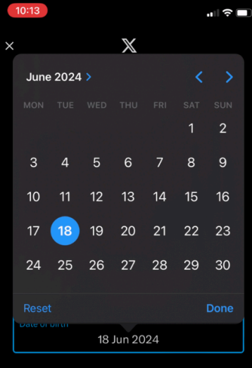
Scrolling Fatigue: Date pickers are a poor choice for DOB fields. Older users must scroll and tap through decades before they get to their birth year - age discrimination! The worst cases, such as social media heavyweight X, force users to scroll back one month at a time - ouch.

Error-Prone Input: If users mistype or misunderstand the required format (e.g., DD/MM/YYYY vs. MM/DD/YYYY), it can result in errors or rejections. There may also be confusion on whether the year field will accept two digits, for example 88 for 1988.
Optimal Solution
The optimal format for DOB is to use three separate text boxes for Day, Month and Year. Label these clearly to eliminate ambiguity and if someone enters two digits in the year field, automatically reformat to the most appropriate year.
The reason that this format works best is it minimises the amount of effort for users. It's 8-10 keypresses / clicks and they are done. There is no need to scroll back through dozens of years or fiddle around with a dropdown. This is backed up by some eye tracking research on date of birth fields we did at Zuko. The three text box format had a much smoother scan path and lower fixation count than other patterns that used dropdowns or date pickers.
A good example is the Co-Op car insurance form which uses the three box pattern and clearly labels each box:

Future Dates: Travel or Policy Start Dates
When asking users to pick a future date, such as a policy start date or a travel booking date, the context and interface need to align with their decision-making process.
The Challenges
Users often need to see the day of the week for future dates, especially when planning travel or scheduling policies. Manually entering a future date can be cumbersome and prone to mistakes if the user is unsure what the pricing is.
Optimal Solution
Whilst we are solidly against date pickers for DOB questions, they can be justifiable for future planning. Date pickers are visually intuitive for short timeframes and help users quickly find and select the appropriate date without guesswork. You’ll want to implement one that allows users to see the day of the week and navigate easily across months. For very near-term dates where people may want something as soon as possible (policy start, train ticket, etc), shortcuts like "Today" or "Tomorrow" as options can be added to save the user time.
As an example, Direct Line’s form provides a date picker with day of week for policy start dates, with an additional “Today” button for immediate selection:

General Advice for all Date Fields
- Provide Format Clarity
Ambiguity in date formats is one of the most common sources of frustration. Always display the required format (e.g., “DD/MM/YYYY”) alongside the field label rather than as a placeholder which will disappear when interacted with.

- Enable Mobile Optimization
Use the appropriate HTML input types for mobile users. If you are using the recommended 3 text box format, use (type="number") to display the numeric keyboard only. Otherwise, if appropriate you can use (type="date") to trigger a device-friendly date picker.

- Handle Errors Gracefully
Implement live validation to catch errors in real-time and provide clear, actionable error messages if something goes wrong (e.g., "Please enter a valid date in DD/MM/YYYY format").

- Use Context-Aware Defaults
For future dates, default the calendar to the current month to save users from unnecessary navigation. For historical dates, set a reasonable starting point, such as five years prior to the current year or the minimum eligible age for your service.

- Avoid Hidden Interaction Costs
If you must use a date picker for historic dates, always offer an alternative text input method so people can shortcut it if necessary.

Design with Users in Mind
Optimizing date fields is about balancing usability with precision. Whether you’re collecting a DOB, scheduling a trip, or asking for a policy start date, the design should take into account the context. Small improvements to date fields can make a big difference in user satisfaction and overall conversion rates.
For more insights on optimizing form fields, explore our comprehensive guides and resources.
We wrote the book on form optimization!
"The best book on form design ever written - 80 pages of PURE GOLD"


More from our blog:
Want to get started with Zuko?
Start a free trial that includes all features, or request a demo


