Why Drop Downs are Bad for Online Forms
We discuss why drop downs in web forms are problematic for users in almost all cases, and give you alternatives to try instead to optimise your form conversion.
You have a (small) finite number of answers to a question you’re asking in an online form. What one of the traditional form elements should you use to make it easy for a user to answer?
Historically, this has been done with drop downs. A drop down is a box, with a clickable arrow that drops down to reveal a list of set responses to a question. Answers are often listed alphabetically or, for numbers, from small to large, so users can quickly scroll to the right response. The way you interact with the field is different on a mobile device as the drop down appears at the base of the screen, or displayed across the entirety of the screen.
For example, take this title field:

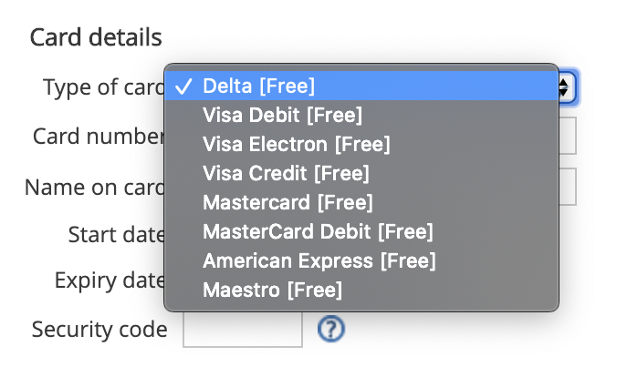
Or this card type field:

Or this list of countries from the same form:

Drop downs are used when there is a set list of ‘correct’, defined answers to a given question. The reason they exist is this seems to make sense - from a data point of view, it’s important that the organization know for certain which card type you are using, or which country to ship something to. Having a free, open text input box may lead to mistakes from users, which might lead to a fatal breakdown in the provision of a good or service.
So far, so good for drop downs.
For more insight and advice into improving your form's design and UX, take a look at Zuko's Big Guide
The problems begin
What is the minimum number of interactions required to pick a value from a drop down?
For desktop users - click the dropdown > review options > select input
For mobile users - click drop down > review options > scroll if needed > select input
That means, at best, drop down requires two interactions to complete, if all the drop down options are visible and a user does not have to scroll to see all the options, and does not make a mistake.
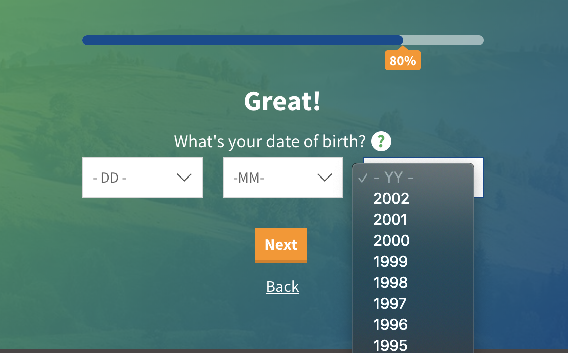
But for mobile users may face a lot more interactions. Take this drop down, asking for date of birth year:

The list of available options are not visible in a single view, leading to an extra step where the user has to scroll, potentially multiple times, to find their correct value. A user might actually have to do this:
Click drop down > review visible options > scroll down (too far) > scroll up (too far) > scroll down more slowly > select input
This is especially true for lists of values where your answer might be one of several. Take us Brits, when asked for Nationality or Country - is that United Kingdom, British, English, Welsh, Scottish, England, Wales, Scotland, Great Britain, British Isles?

Surprisingly tricky.
Almost without exception, dropdowns by their very design require more effort to complete, and these problems are more pronounced for mobile users with their limited screen sizes. Part of the reason for this is that for many drop downs, the list of options is not visible in its entirety when clicking the drop down for the first time. A user therefore has to scroll up and down to review the number of options that fit on the screen.
This is especially difficult is the available options aren’t an intuitive list - it’s one thing to scroll down past years listed in ascending order, but what about this list?

It’s not in alphabetical order, and as a user you’d want to review all the options before selecting one in order to select the one closest to your actual job role. This could take a lot of time.
So in summary, here’s a non exhaustive list of the problems with drop downs:
- Not all users will know how drop down field work
- They require a higher number of minimum interactions to select a value
- For mobile users, a small number of options are visible at any one time
- For non-ordered lists, finding the correct value can be time consuming tiresome
The alternatives
So if drop downs are not ideal for users, what should you use instead? Well, this depends on the information being asked for.
For example, take title fields. Compare the following way to ask for title instead of a drop down:

Let’s think about the minimum number of interactions required:
For desktop users - review options > select input
For mobile users - review options > select input
A single interaction. The above is a radio button, style so the options and clickable areas are nice and large for both desktop and mobile users.
For date of birth day, month and year, using drop downs, the sequence would look like this:

For desktop users - select drop down DD > review options > select value > select drop down MM > review options > select value > select YYYY dropdown > review options > select value
For mobile users - select drop down DD > review options > select value > select drop down MM > review options > select value > select YYYY dropdown > review options > select value
A minimum of 10 interactions. Compare that to this:

For desktop users - focus in > 6 keypresses
For mobile users - review options > 6 keypresses
A simpler, faster experience for users, with only a mildly higher change of mistakes, especially if the inputs in the above are restricted to numeric keys only.
Some workable alternatives to common field types
Yes/No questions

Radio buttons, with large clickable areas
Title fields, or any small finite list of options

Radio buttons, with large clickable areas
Date of birth fields

A single text box that only accepts numeric characters, with dividers ‘built in’ to the box itself. The field typed should be ‘tel’ for mobile users:

This ensures that a numeric keyboard opens for mobile users, so they do not have to switch keyboards.
Longer lists of predefined values, which are not a logical ascending or descending list
If you know some of the more popular options, display those as radios, with a last option that allows a user to then click on a drop down, or free enter another value:


This style would also work for asking for country of residence or nationality - the most common options would be displayed as a radio, with a drop down as a second/last resort.
Numeric values across a set range


Sliders, or buttons to increase/decrease buttons, ideally with the option to free enter the information.
Always look for the alternative
It may not always be possible to find an alternative to a traditional drop down, but where possible, find a way. They are surprisingly problematic for users, and should be phased out wherever possible.
Do drop downs cause users to abandon your form? Test this out by getting started with a Zuko free trial or demo.
We wrote the book on form optimization!
"The best book on form design ever written - 80 pages of PURE GOLD"


More from our blog:
Want to get started with Zuko?
Start a free trial that includes all features, or request a demo


