Zuko Competitor Comparison
Comparing Zuko to other products in the UX and Analytics market
There are many out there, and they all offer various different features to help understand your visitors. It can be a difficult process to work out exactly which combination of products will fit your needs and requirements and give you the insight you require for the budget you have available.
Our Comparision Table
Below are some of the more common ones we get asked to line up against, and you may be surprised at this comparison table:
Zuko is different.
Zuko is a specialist product, designed with one aim in mind: deliver the world's best form analytics and insight.
Instead of building out a feature set that covers all of the above bases and 'does a bit of everything', Zuko focuses on one, vital part of the customer experience, and does it really, really well. For a full comparison of Zuko vs the others on detailed form analytics features, you can either click the below button or scroll to the bottom of the page (spoiler - Zuko does better in that contest!).
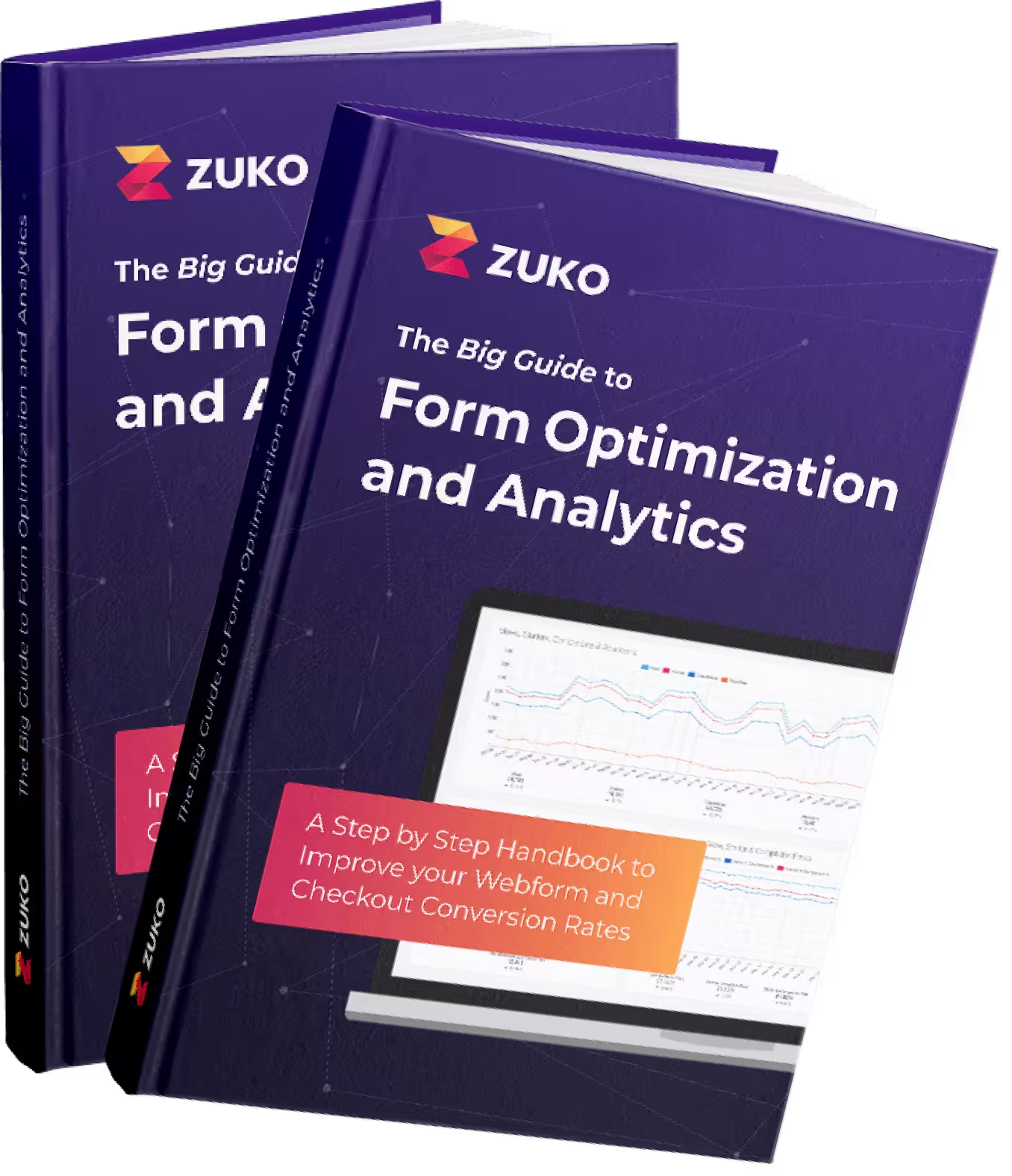
We wrote the book on form optimization!
"The best book on form design ever written - 80 pages of PURE GOLD"


Why does Zuko focus just on forms?
1. Forms are such an important part of the customer journey, we believe it is vital to understand user behaviour in them fully.
Almost every customer journey involves a form. Almost all of the value generated by a website comes from people completing forms. Imagine if your websites' forms all broke at the same time for weeks. You might still make some offline sales, but we're sure that your business would be in trouble. Similarly, a good form journey and experience can transform the fortunes of a business. By improving the conversion rate of an online form, a company can sell more, make more effective use of its marketing budget, and importantly offer a customer a better experience when interacting with their brand online. It's because of this importance that we believe you need the best product possible to help you understand and improve those online forms.
2. Forms are often complicated from a code standpoint, and therefore often difficult to track technically.
Almost every customer journey involves a form. Almost all of the value generated by a website comes from people completing forms. Imagine if your websites' forms all broke at the same time for weeks. You might still make some offline sales, but we're sure that your business would be in trouble. Similarly, a good form journey and experience can transform the fortunes of a business. By improving the conversion rate of an online form, a company can sell more, make more effective use of its marketing budget, and importantly offer a customer a better experience when interacting with their brand online. It's because of this importance that we believe you need the best product possible to help you understand and improve those online forms.
Why would I use Zuko instead of something that offers more?

Other than the reasons listed above, we believe that many organisations want the best tool for each job. For companies who know that their forms are a vital part of the future success of the company, we know that getting 'a bit' of insight is not enough. Zuko reliably and consistently uncovers insights about customer behaviour in online forms, and only a specialist tool can do that.
We see Zuko as a steak knife (brilliant at doing one thing) against the Swiss army knife approach (do a lot of basic things) of the other tools in the market.
It doesn’t have to be an “either-or” situation though. Many of our clients add Zuko’s superior form analytics capabilities to one of the “jack-of-all-trade” UX tools to give themselves breadth and depth - the best of both worlds.
Other companies have taken a similar approach:
- Optimizely does not offer session replay, it does A/B testing and personalisation really really well.
- Google Analytics does not offer heat maps, it does webpage analytics really really well.
- Zuko does not do Session Replay, it does form analytics really really well.
How do I know if I need Zuko?
Of course we believe everyone should be making their online forms better through data, but we also understand that for some businesses this is even more of a priority. If the forms on your site fall into one of more of these categories then we think you should be using Zuko immediately:
- Your forms are long, complex and cannot be shortened by simply cutting fields
- Your business is in a competitive market, with lower brand loyalty than you'd ideally want
- You cost per acquisition is higher than you'd like
- The lifetime value of your customers is high (so each additional customer is very valuable to you)
- Your business cannot be successful without people filling out online forms
You may see other products claiming to do more than Zuko, but you'll not find another product on the market that even claims to do form analytics better than us. We're the best at what we do, hands down. Zuko is the best form analytics product in the world.
Find out more about how Zuko can improve your online forms
Product tour
Pricing
Working with agencies
Form Analytics Feature Breakdown
We've given you on overview of 'big picture' UX features above. However, the professional optimizers and experimenters among you will want to know much more about why we think that Zuko outperforms the competition in Form Analytics specifically. This table breaks it down for you, showing how we compare when it comes to the detailed features that give you the extra insight you need to optimize your form performance. (More details on each feature are below the table). We also have breakdowns for other comparable products such as: Microsoft Clarity, Mouseflow, Insiteful and VWO.
/Glassbox
story
