What is Conversion Rate Optimization (CRO) and how does it apply to forms?
An overview of CRO and how you can use it to improve your website's user experience
An overview of CRO and how you can use it to improve your website's user experience
Conversion rate optimization (CRO) is a hot topic at the moment with marketing budgets stretched and execs being pressed to deliver ever more value from their dwindling resources.
Whilst Zuko Analytics has been designed to deliver improvements at the sharp end of CRO - forms and checkouts - we are aware that there is a broader CRO context that it is important to understand in order to maximize returns from any optimization programme.
This article outlines the basics of CRO - what it is, why it’s important, how you improve it, which tools can help you and why it’s important for digital forms.
What is Conversion Rate Optimization?
At its core, CRO is the process of improving the percentage of your website visitors who take a desired action (a “conversion”). It involves understanding how users arrive on your site, their behaviour as they move throughout the site and the barriers that stop them from “converting”.
How to calculate conversion rate
To calculate conversion rate, you first need to define what a conversion is to you. Traditional eCommerce sites typically use a confirmed sale but there are many different actions you may want to define as a conversion depending on your objectives. They include things like:
- Completing a lead generation form
- Watching a video
- Applying for a service via the site’s form
- Newsletter sign-ups
- Social shares
- Item added to shopping cart
- Engaging with a representative via live chat software
- Subscription to a freemium service
- Click on an article / advertisement
- Requesting a quote
Once you’ve defined your conversion, your web analytics software should be able to tell you the number of times the conversion has occurred over a set period of time. You then compare this to the number of unique site visitors and divide the conversions by the visitors figure to give yourself a percentage conversion rate.
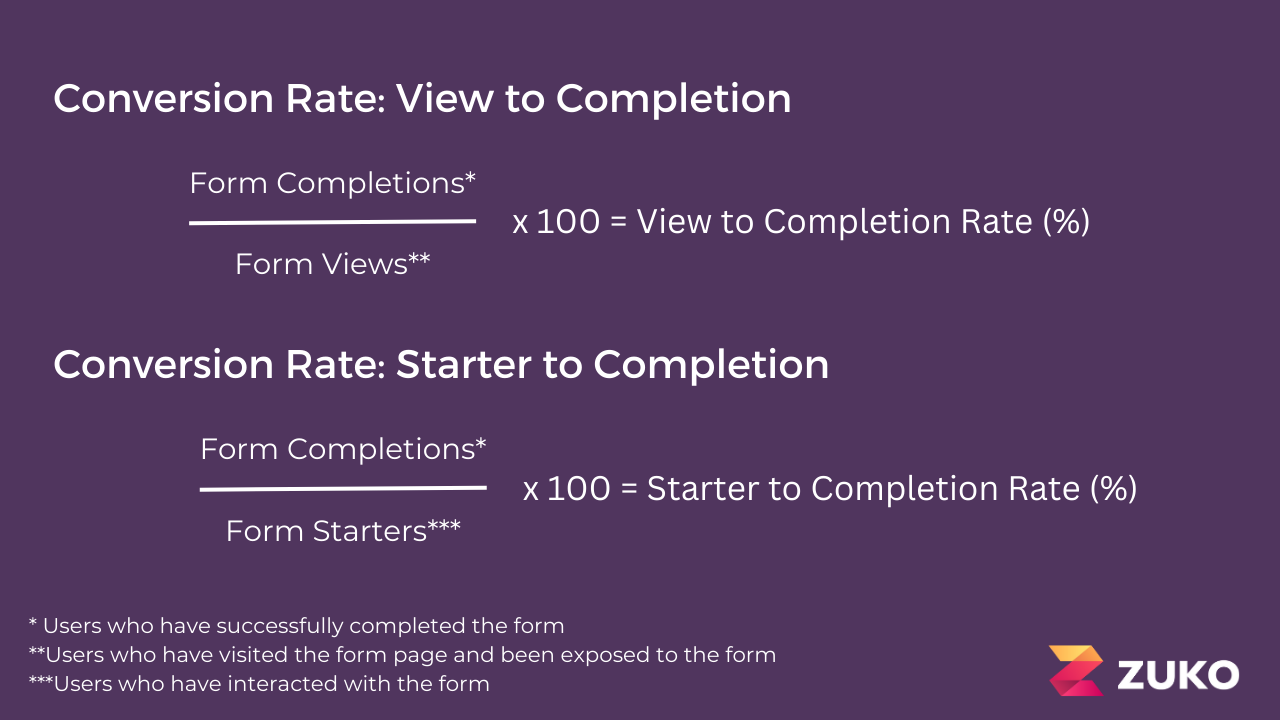
The below graphic shows the conversion equation in a forms context, showing how you calculate the view-to-completion and start-to-completion conversion rates.

Why is CRO important?
You can think of CRO as a pivot that leverages the rest of your marketing effort. The better your conversion rate, the better return on investment your overall marketing budget will deliver.
As a simple example, imagine that you have 1,000 monthly visitors to your website, a conversion rate of 50% and a value per conversion of $100. By running CRO activity that improves conversion to 60% the volume of conversions rises from 500 to 600, worth an extra $10,000 in value per month.
The great thing about CRO is that, once completed, its effects can last for a long time afterwards. Unlike some other marketing campaigns, once you’ve made conversion improvements to your site they’ll deliver benefits for month after month rather than just being a one-off sales uplift. Some sources cite an average ecommerce conversion rate in all industries of 2-3% so there is plenty of room for improvement.
What is a good conversion rate?
This is the question that we probably get asked more than any other. The truth is, the only real answer you can give to that is “better than last month”. Every website and form is unique, with different target audiences, so a “good” rate for one site may be suboptimal for another. The only benchmark that you should really be judging yourself against is your own.
That said, as a form analytics software provider, we at Zuko do have access to a wide range of conversion data across most sectors. We’ve published this form conversion benchmarking data so you can look at that if you do want to see what the prevailing conversion rates in your industry are. As we mention though, be careful. The forms in our database will not be the same as yours so don’t treat the numbers as the be-all-and-end-all.
Is there such a thing as CRO best practice?
Hmm, a controversial one. Our view on this is “yes and no”.
Some hardcore experimentation pros say there are never any best practices. You can’t use a “one size fits all” approach - only by experimentation and targeted testing can you learn what works for your site.
Whilst this may be technically true, not everyone has the resources or traffic to conduct comprehensive testing programmes. In these situations, there are UX patterns and heuristics that have, on average, improved conversion across a wide range of websites (you can see many of these UX patterns related to forms here). These are a good place to start when improving your site. Even if you do have a full testing programme, they may still work well as a starting hypothesis.
In the case of truly heinous UX experiences there are also JDIs (“Just Do It”s) that you could, and should, implement without testing. For example, if your font size is too small for many users to read you should increase that up to a minimum of 16px.
How do you improve conversion rate?
This is the meat of the conversion rate optimization process. By following a set of steps you can identify and fix the UX issues that are preventing your site visitors from converting.
Whilst the exact stages vary by CRO practitioners (some agencies have codified these into frameworks), the rough steps to follow include:
Identify the goal: What do you want to achieve? Usually this means setting what the “conversion” that you want to increase is.
Analyze your current website data: By looking at current behavioural patterns in your website analytics you can understand where users may be dropping out so learn where you should be focussing your efforts.
Consider additional UX research: As well as general analytics, you may want to employ more advanced techniques to understand where the points of friction on your website are. This may be something specific like form analytics to reveal which fields are causing abandonment, or something broader like heat mapping or session replay.
Identifying improvement areas: Based on your analysis, you can identify the UX issues that are causing abandonment. This gives you direction on the things you may need to change.
Create hypotheses for improvement: The UX research will have shown you the things to improve. Your hypothesis is a statement on which changes should be made and how they should be implemented. Your change might encompass anything on the site such as improving loading speed, making it more mobile-friendly, or simplifying your checkout process.
Test hypothesis: To determine whether your hypothesis will result in a conversion improvement you need to properly test it. The most usual way is using an A/B test where the current version of the site is tested against the modified version to see which performs better. However, if you don’t have the traffic to effectively do that, you can make the change and then see how conversion is effected.
Implement changes: If your hypothesis was a test winner you’ll want to roll it out for all traffic to your site.
Monitor results: You’ll want to keep tracking to confirm whether your changes continue to deliver a higher conversion rate rather than the uplift being due to a novelty factor.
Rinse and repeat: Once you’ve made changes that improve conversion rate it shouldn’t be over. Delve into the latest user behaviour data to determine what are now the biggest causes of abandonment and work to fix them as well.
How does CRO apply to forms?
Forms are the sharp end of any conversion funnel. They are where the potential customer finally commits their personal or financial details to become a “conversion”. Getting them wrong will cost businesses huge amounts of lost business.
And yet forms are often overlooked in optimization programmes in favour of “sexier” site elements such as the home page or product pages. If you want to maximize your site’s performance, it is critical to include forms and checkouts in your CRO process and to use a form builder or CMS that allows you to change the form design.
Forms have their own unique dynamics so you need to research them with a dedicated form analytics tool and develop hypotheses to improve them. You can read this article on hypotheses to test on forms to get started but the broad categories of form UX issues that cause abandonment are:
- The user is not motivated enough to complete the form
- The customer doesn’t want to provide the data you are asking for
- The visitor does not have the information you need at at the moment
- Your form is broken or has issues that make the user experience bad
- One question is so intimidating or complex the user abandons rather than trying to answer
- You are inadvertently driving users to external sites and they are never coming back
Aside from this, forms can be seamlessly added to any testing and optimization process. To aid this, Zuko has integrations with some of the most popular A/B testing tools so you can include forms as part of your experimentation programmes.
What software can you use for conversion rate optimization?
There are dozens of CRO related products on the market that can help you improve your site. However, they tend to fall into two broad categories.
(i) UX Research Tools
These are tools that use data to help you identify issues and refine hypotheses. They are focused on historic user behaviour to develop strategies for improvement. There are several subcategories which address different needs:
General Web Analytics - These tools provide a good starting point to understand how users flow through your site and which pages they drop off on. The most well known of these products is Google Analytics (mainly because it’s free) but there are paid tools such as Adobe available as well.
Form Analytics - This focuses on delivering deep insight on form behaviour at the individual field level to deliver insight on where users are struggling. We’re obviously biassed but we’re certain that Zuko Analytics’ form optimization reports are the most comprehensive and useful ones out there if you need to improve your form’s conversion rate,
UX Visualisation + research tools - These are a category of tools that provide specific functions to understand user behaviour such as heat mapping, session replay or user surveys. They tend to be bundled together and offered by vendors such as Glassbox, Hotjar or Decibel.
(ii) Experimentation Platforms
These are software products that allow you to construct and run A/B tests to determine whether your hypothesis is a winning one.
The many providers of such testing tools include Sitespect, Convert.com and Optimizely.
In Summary
CRO is a potent weapon for the savvy digital marketer. It leverages all the spend from your other marketing channels, making your customer acquisition efforts much more efficient and delivering more conversions from the same budget.
For more information on how you can use CRO techniques to improve form conversion check out Zuko’s Big Guide to Form Optimization & Analytics.
Common Questions about Conversion Rate Optimization
What is conversion rate optimization (CRO)?
Conversion rate optimization (CRO) is the process of increasing the percentage of website visitors who complete a desired action, such as making a purchase or submitting a form. It involves analysing user behaviour, identifying friction points, and making data-driven improvements to increase conversions.
How does CRO apply specifically to web forms?
CRO applies to web forms by focusing on improving the part of the user journey where conversions actually happen. Forms and checkouts are often the highest drop-off points, so optimizing them by reducing friction, simplifying inputs, and improving UX can significantly increase conversion rates.
What is the best way to improve form conversion rates?
The most effective way to improve form conversion rates is to use data-driven optimization. This includes analysing user behaviour at a field level, identifying where users abandon or struggle, and testing improvements through experimentation. Tools like Zuko help uncover these insights so you can prioritise changes that have the biggest impact.
We wrote the book on form optimization!
"The best book on form design ever written - 80 pages of PURE GOLD"


More from our blog:
Want to get started with Zuko?
Start a free trial that includes all features, or request a demo


