The Secrets of High-Converting Car Insurance Forms
Guidance on how to unlock a higher conversion rate for your insurance forms
Guidance on how to unlock a higher conversion rate for your insurance forms
For car insurance providers, online forms are the make-or-break point in their conversion funnel. They serve as the gateway to delivering quotes and securing customers, yet they remain riddled with friction, confusion, and inefficiencies.
Zuko’s latest white paper reviews 27 UK car insurance forms, breaking them down by element and ranking them based on user friendliness. The report looks at the key fields for any car insurance form, highlighting not just why these fields matter but also showcasing examples of how top-performing forms execute them effectively.
You can download and read the report for all the details but this blog provides a preview of the key insights you’ll find in the full paper.
Download the market report on car insurance forms
Key Elements of Optimized Car Insurance Forms
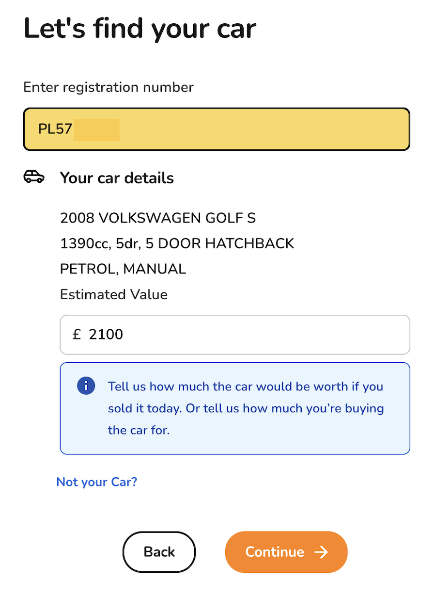
1. Vehicle Lookup
The car finder function is a non-negotiable feature for car insurance forms, and the best versions do much more than just locate a vehicle by its registration. The most effective implementations, like those seen on Esure, pre-fill key details such as vehicle value, significantly reducing the user’s workload. For users without a registration number, offering manual input options that remain intuitive and straightforward is equally essential.

2. Employment Details
Employment questions can be a major sticking point for users leading to frustration or abandonment. Many users worry that entering an “incorrect” job title will result in future claims being denied. Adding to the complexity, forms often require users to categorize their job into predefined industry lists, which can feel restrictive or unclear.

Top solutions include:
- Offering free-text input and handling categorization on the backend.
- Using smart search functionality that suggests relevant titles as users type.
- Reassuring copy that alleviates users' fears about providing accurate responses.
Saga’s evolving job title search provides a great example of user-centric design that reduces friction:

3. Sensitive Contact Information
Some fields, like driving license numbers or contact details, are inherently sensitive and prone to causing user drop-off. The best forms explain why this information is needed and ensure users understand how their data will be used.
For example:
- By Miles is explicit on the circumstances they will use an email address.
- Saga labels phone number fields as optional and explains the benefits of providing them, balancing user trust with data collection needs.


4. Annual Mileage
Annual mileage is a tricky field that can trip up users. Many struggle to calculate exact figures, leading to frustration or inaccurate entries. Innovative forms provide tools to simplify the process, such as allowing users to input daily or weekly mileage and automatically converting it to an annual estimate.
The calculator-style approach used by 1st Central is a standout example of how to turn a potentially overwhelming question into a simple, user-friendly interaction.

Design and Formatting for Car Insurance Forms
Whilst the above advice was for fields that are specific to car insurance forms, in this section we’ll look at more general form design tips that are still relevant to insurance forms but can also be more broadly applied.
Progress Bars
For multi-step car insurance forms, progress bars are useful for guiding customers. They give clarity on how many steps remain and reduce the perceived workload. The best implementations, like Policy Expert’s, allow users to revisit completed steps, creating a sense of control and transparency.

- The user can see the number of steps to completion.
- Each step is clearly labelled with a step title
- Once a step is complete, it is marked with a tick. Not only is this a marker of progress, it is also motivating for users to see their progress validated.
- Once a step is completed, the user can click on the step title on the progress bar to go to that step.
“What You’ll Need” Pages
Nobody likes starting a form only to realize halfway through that they’re missing key information or are ineligible for a quote. Providing a “What You’ll Need” page upfront, as seen in Tesco Bank’s forms, sets clear expectations and avoids unnecessary frustration.

Rethinking Dropdowns
Dropdown menus are a necessary evil in some cases, but they’re far from user-friendly. They hide options by default, require more interaction, and can be especially fiddly on mobile devices. Wherever possible, replacing dropdowns with radio buttons - like Churchill does for license questions - can significantly improve usability.

For longer lists where dropdowns are unavoidable, making them searchable, as demonstrated by Hastings Direct, can reduce friction and improve accuracy.

Save-and-Resume Features
Car insurance forms are often long and detailed, making save-and-resume functionality important for reducing abandonment. Surprisingly, only 7% of the reviewed forms offered this feature. LV’s implementation, which allows users to create an account and pick up where they left off, provides a great example of how to support this need.

Avoiding Mandatory Account Creation
Forms like Elephant’s, which require users to create accounts before seeing their quotes, are a prime example of poor UX. Many people won’t want to commit to an account until they have at least seen a quote so these data grabs can backfire, reducing completion rates.

The Final Word: Focus on the User
Each field and interaction on a car insurance form contributes to the overall user experience. From simplifying complex fields to providing clear guidance, optimizing your form is about removing barriers and building trust with potential customers.
The Zuko report examines these elements further, offering actionable insights and examples of good & bad design from leading car insurance providers. Download it now to unlock the full potential of your forms and drive higher conversions.
Download the market report on car insurance forms
We wrote the book on form optimization!
"The best book on form design ever written - 80 pages of PURE GOLD"


More from our blog:
Want to get started with Zuko?
Start a free trial that includes all features, or request a demo


