How to use Funnel Analysis with your Forms and Checkouts
Advice on improving your form conversion by breaking it into stages with funnel analytics
Using funnel analytics to improve the performance and conversion of your online forms
With the launch of Zuko’s new Funnel Builder feature, we thought it was high time we wrote about the use of funnels in conversion optimization for forms and checkouts. This article takes you through what funnel analysis is, the benefits of it and some thoughts on how to use it most effectively.
What is Funnel Analysis?
Funnel analysis involves breaking up your form (or website) into discrete stages or steps through which your user must pass to get to the end goal (typically, a successful form completion). You then overlay analytics data to show how many users interact with each stage, how many abandon, plus additional metrics such as length of time taken and progression rates.
In the context of an online form, it allows you to group questions relating to a similar topic (such as personal details, order details, payment, etc) as one so you can analyse them in aggregate before you look at the constituent parts. It is particularly relevant for forms with multiple steps where a user has to successfully complete each stage before moving onto the next.

This type of form analysis allows you to see the volumes of users who visit each stage and how they flow through the form towards completion. Typically, the shape of such a visualization is like a funnel - larger volumes of users at the initial “top” stages tapering to much lower numbers in the latter steps, hence where “Funnel Analysis” gets its name. It shows you how many users progress from one stage to the next, potentially identifying areas to improve in order to increase conversion rates and reduce abandonment.
What are the benefits of Funnel Analysis for forms and checkouts?
Breaking your form down into manageable chunks is often a quicker route to getting user insight in order to improve your form’s conversion. Here are some of the ways funnel analytics can be useful;
1. Quickly identify which areas of the form users are struggling with
When you first look at your form analytics data, particularly for a long form, it can be overwhelming. You may have dozens of form fields to review and analyse and you may not know where to start. Funnel analysis helps guide you with this, focusing attention on the general areas where users are dropping off. You can then concentrate on the most relevant sections and drill down to find what is driving abandonment within them.
For example, in the below funnel, the vast majority of abandonments take place in the first stage so that is where the optimization effort should start.

2. Easy visualization and presentation
If you are presenting your form analytics findings to get internal stakeholders aligned with your conversion rate optimization recommendations, they are often more concerned with bigger picture things rather than studying the minutiae of individual fields. Funnel analysis is a great way to give them a quick, intuitive, overview; demonstrating where the problem areas are to get buy-in to fix them.
3. Understand timings in more detail
Grouping stages together makes it easier to understand where users are using their time. You can quickly see where they may be getting lost or spending unnecessary time working out how to successfully answer a question or progress from the stage.
4. Cross referencing against audience segments
A good funnel analytics software product should integrate with your audience segment tracking to help you identify how individual groups behave differently on your form. They’ll help you answer questions such as:
- Do successful conversions spend more or less time than abandoners in certain funnel steps?
- Does paid traffic drop off at different stages than organic traffic?
- Do certain groups (such as returning users) skip steps entirely?
- How does stage progression rate differ by product type?
How many steps should you have in your funnel analysis?
This is one of those questions that’s akin to “How long is a piece of string?”. The short answer is “As many as you need”. However, it is not always that simple.
If you intend to present your data visually, you probably don’t want many more than five or six steps otherwise you could have a very messy visualization. Certainly, if you have more than ten stages you should consider whether you can combine stages or create “sub-funnels” for separate analysis.
When shouldn’t you use funnel analysis?
Funnel analysis is great for all the reasons we’ve outlined above but there are certain scenarios where it may not be appropriate. Namely;
1. A simple one page form
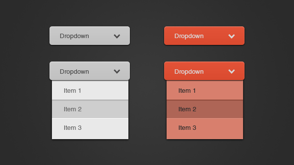
If you have a single page form with not many fields (think a simple contact form like the example one below from Jotform) you may be overegging the pudding.

This form is essentially one stage and, while you could, in theory, make each field its own stage in the funnel, you would be overcomplicating things. Your standard form analytics dashboard reporting should suffice, giving you the answers you need.

2. Non-linear forms
If your form contains a lot of conditional logic meaning that each user is taken on a different path dependent on their answers, then running funnel analytics may be problematic. Funnel analysis relies on users mainly going through the same stages so valid comparisons and conclusions can be made. If users are being moved down divergent paths based on their different situations those comparisons are harder to make.
In theory, if the conditional logic is not too complex, and there are a limited number of pathways the user can be directed down, you can create a number of sub-funnels to analyse. Visually, this probably looks more like a fork than a funnel but you get the point!
3. Users beginning at different stages
If you have different groups of users starting their form journey at different stages (for example a user returning to a saved basket), you need to be careful. The data can look very strange with “lumpy” funnels and odd looking progression rates.
You can still use funnel analysis in this scenario but we would recommend segmenting the audiences that begin on different steps and looking at them in isolation so the data is not polluted by other groups.
In Summary
- Funnel analysis is a great way to quickly identify the broad form steps that users are having problems with
- Visualization of a checkout funnel can be useful in persuading internal stakeholders that there is an issue with your user experience
- Up to 5-6 steps is optimal for visualising your funnel
- Be careful running funnel analysis for single page forms, non-linear forms or forms where users start at different points
For more form optimization guidance, download Zuko’s Big Guide to Form Optimization and Analytics.
We wrote the book on form optimization!
"The best book on form design ever written - 80 pages of PURE GOLD"


More from our blog:
Want to get started with Zuko?
Start a free trial that includes all features, or request a demo


