
A Beginner's Guide to Mobile Form Design (+Mistakes You Should be Aware of)
How to design a good mobile form and what mistakes you should avoid
With the rise of people being ‘always on’ (that is, always online) naturally comes the rise of mobile dependency. Most online activity that people participate in now is completed on a mobile device and not the traditional desktop computer.
Because of this, gone are the days where web developers only had to make sure their designs could be viewed correctly on a 20 inch screen. Now, there is more chance of their designs being experienced on a mobile device with a much smaller screen so logos and other brand assets must be designed with mobile screens in mind.
Mobiles are also associated with the idea of immediacy. When somebody completes an action on their mobile phone, they do so anticipating a quick result.
One of the biggest obstacles to quick interactions on mobiles are poorly designed forms. Below we explain the biggest mistakes to be aware of when optimizing a form for mobile.
Firstly, let’s properly define mobile forms.

What are mobile forms?
Mobile forms refers to any kind of form a mobile user has to complete. This could be anything from filling in bank and address details for a purchase, or signing up for a newsletter.
When these forms are completed traditionally - on a desktop - there are less UI issues that have to be taken into consideration.
Users complete these forms with a full size keyboard, a large screen, and a mouse.
When completing mobile forms, users have the opposite to work with. They use their thumbs, a small keyboard, and have a much smaller screen. It’s also likely they aren’t sitting at a desk. They could be completing the form on a train, in bed, or even walking down the street.
These points may seem irrelevant for advice on designing a form, but they all come into play when designing a mobile form that will get the best completion rates.
Below we explain the mistakes to avoid when designing your mobile form.
Mistakes to avoid!
Making a form mobile-friendly might sound simple at first, but there are a few ways you can make the form submission difficult for mobile users, or put them off completing the form altogether. Below we explain what these mistakes are and how to avoid them.
Difficult to complete signatures
Some forms require a signature. Traditionally, an electronic form will have been printed out and signed physically. But with the rise of digitalization and mobiles, people aren’t as prepared to do this. Plus, it isn’t appropriate for every form.
Make sure you use the best digital signature software if your mobile forms require your users to sign anywhere. The best software will take into consideration that somebody is using a finger and transcribe the screen drawing most correctly.
Writing a signature on a mobile device is particularly challenging as your finger is a lot thicker than the signature you’re trying to write! Because of this, ensuring the software you’re using is perfect for transferring finger-drawn signatures is crucial.
Not showing completion progress
If your mobile form requires more than one page of input, the completion process can start to feel daunting to users. When will it end? Are they wasting their time?

By showing a progress bar in online forms, or telling them which step number they are on, you’re encouraging your user to carry on to the end.
Seeing that progress bar go up, or moving to the next step in a process, is a great way to motivate people to complete the form.
Asking for too much information
Filling out forms can be boring. And filling out forms to submit online can feel unsafe. Once you press the submit button, where is that information going? These thoughts put together creates a lot of users unwilling to input more than the smallest amount of information.
When you’re deciding on the form fields to include, remove any that would provide you with information you absolutely won’t need.
For example, if your mobile form isn’t collecting information on someone’s delivery address - do you need to ask for their address?
Is your form for gathering information from a potential client or customer to give them a quote? Think about what data you will need to input into your proposal creation software and only ask for that information.

Imagine removing each form field individually and see if you can still complete the action without that field. If you can, remove the field.
This will help you create a streamlined form that doesn’t look cluttered, unprofessional, or daunting to users.
Not explaining what you will do with the information
As alluded to above, when being asked for personal information, users will want to know what their information is going to be used for.
When you ask for personal and secure information on a mobile form, be sure to add a side note stating what this information will be used for, and letting users know that it will be kept confidential.
This is particularly important if you are creating a registration form. To create a high converting registration form you need to look completely trustworthy and efficient to users. This is likely their first time interacting with your business and they’re interested - that’s why they’re on a registration form!
But if they start to question why you are asking for personal details, they will look elsewhere.
Whatever sector you are in, the competition online is so high that all it takes is one questionable-looking form for a potential customer or client to look elsewhere.
Not showing errors immediately
You’ve finally filled all of the required fields and you press ‘Submit Form’. But it doesn’t submit and you are sent back to the top of the form. You filled in a field wrong or left a required field incomplete.
There is nothing worse than the false hope that you are done!

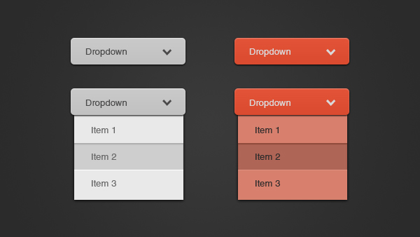
Have your forms produce error messages or point out missed out fields in real-time to reduce drop-outs. Make these messages very obvious too, such as by using the color red (see above) to signal something is wrong and requires attention.
As we have already mentioned, mobile users are used to quick and easy tasks. To users, mobile correlates with speed and efficiency. So a lot of the time, if they have made an error in a form and aren’t told until the very end, they will just close the form and not return to it out of frustration of wasted time.
Showing errors in real-time can optimize form submission speed and completion due to the efficiency of informing users of any errors in their input immediately. The less somebody feels like they are wasting their time, the more likely they are to complete the task.
Not adopting a single-column format
With a long mobile screen, you need to adopt a single-column format. Mobile users scroll up and down, not side to side.
If you have a lead gen form with a multi-column layout, users will easily miss fields because they simply don’t fit on the screen and as they are using a mobile device, they won’t think to swipe sideways, only down.
Moreover, a single-column layout speeds up the completion process as it is easier to go from one field to the next.

Not optimizing for thumb reachability
On the topic of scrolling, when navigating a mobile form, users will be using their thumbs. Thus, a great way to improve your conversion rate is to make your mobile forms easy to complete by navigating the form with only thumbs.
For example, for fields that require the user to input text, have the field reach to both sides of the screen so that the user can comfortably select it regardless of which hand they naturally hold their device in.
Not making the most of auto-completion
Online transactions are a lot more time-consuming than in-person transactions. This is because you have to input your card details. Or do you?
If your form requires payment details, let your users auto-complete this part of the form. A lot of mobile users have their card details saved to their device and these details can be automatically added to a form with just a finger-print confirmation.

Having such an option available on your mobile form reduces the chances of drop-out because the user won’t need their bank card on hand to complete the form.
In addition to this, typing on such a small screen makes spelling mistakes frequent. With auto-fill, fields such as the address fields can be auto-corrected, helping out users who may be typing in a rush. It also means if this information is needed again further down the form, it is automatically added.
Do you have a document that you need a client to complete that requires the same information across different parts of the form? There is plenty of free document signing software out there that will automate field completion too.
Having a form with distractions
Keep your mobile form design simple.
If the page that users are completing a form on contains distractions, such as ads or links to other pages, they can easily lose track of what they are actually there to do.
Moreover, having a plain form increases accessibility. Those with dyslexia, for example, will struggle to read the fields if they are placed over a red background. Others might find pure white too bright. Have a soft-toned background.
On top of this, ensure you have bold and impossible to miss action buttons. Once the form has been submitted, make it clear to the user with a ‘Thank You’ message upon successful submission.
Conclusion
Optimizing your online forms for mobile completion increases your completion rate by creating a hassle-free and efficient experience for users.
Mobile form design should not be a last-minute thought in your form design process because with the general preference for mobile over desktop, you are reducing your business's chances of success by not prioritizing the mobile user’s experience.
By avoiding the above mistakes you can easily create a mobile form with a design that works and doesn’t deter!
If you are looking for software that automatically creates a mobile optimized form then check out Zuko Form Builder which can publish a mobile form for you in minutes.
About the Author

Yauhen Zaremba
Yauhen Zaremba is the Senior Director of Demand Generation at PandaDoc. Yauhen is a growth-focused market leader with more than 14 years of B2B and B2C marketing experience. For the past seven years, he has focused entirely on the electronic signature, proposal, and document management markets.
We wrote the book on form optimization!
"The best book on form design ever written - 80 pages of PURE GOLD"


More from our blog:


Want to get started with Zuko?
Start a free trial that includes all features, or request a demo