How to Ask about Sensitive Information in a Web Form
Do you need to ask users some sensitive questions in your online form? Here are a few pointers.
We were recently involved in an online conversation about asking for potentially sensitive information in an online form. We thought this would be a good opportunity to gather some great resources on the topic and give you some guidance on how best to ask for this information, reassure users and avoid risk of alienating your customers.
What information is sensitive?
The list of personal information that users may consider sensitive is long, and different for each person.
- Email Address
- Phone Number
- Date of Birth and Age
- Gender or Sex
- Health Information
- Marital Status
- Religious and ethnicity information
- If they have any disabilities or any health issues
Some of this information (the first three at least) are often required to gain access to a product or service and on the whole, people are accustomed to providing them as part of that trade off.
There can be some hidden traps even with the more standard questions. For example, asking for title information asks more than simply what to address a customer by in correspondence. You are asking for someone’s marital status if they are a woman, and also their gender. We’ve covered the topic of titles in forms before but you should consider the necessity of all of the questions you ask users. Ask yourself a few more times, until you’ve seriously considered cutting some fields.
Another approach to this is recommended by the UK NHS service manual website:
Make a list of all the information you need from your users now for you to deliver the service.
Having a list forces you to question why you're asking users for each item of information. It also helps you challenge unnecessary questions. (This list is sometimes called a "question protocol".)
Work out what information your organisation already has (or can access) and where you have information gaps. Ask the questions that let you fill the gaps.
For the fields that you have left, you may still need to explain why you are asking for that information.
Transparency is key
For all of the information above, it may be necessary to explain to users why you’re asking for this information. All forms are a trade off for users - they don’t want to complete them in themselves but know they have to in order to access your good or service. There may be some information that upsets the balance of that tradeoff however and has users asking themselves why you need that information in order to provide the service.
If you explain it clearly, and it seems necessary to the user, they should be more than happy to provide you with that information.
For example, when asking for a phone number, you should try to explain how it will be used:

For any information listed about, consider providing some reassurance an information within your online form that explains:
- Why it is being asked for (to contact the user, as part of their logging into an online platform, for marketing purposes or demographic information)
- What it will be used for
- Any privacy measures you will be taking with that data.
Asking about disabilities
In the Twitter conversation, some great advice was given if you find yourself having to ask users about any potential disabilities. It would be a disservice to paraphrase them, so here is one answer from Caroline Jarrett (@cjforms):

As you can see from Caroline’s answers, some of the same principles apply - for example being clear why you are asking. Again she stresses asking for information in a way that ensures it is relevant to the task at hand. For example you may want to ask someone if they require a larger font used in correspondence, but do not have to ask if they are in a wheelchair.
And from Dan (@dandoescontent):

A interesting take away from both of these insightful answers is that if you understand why you’re asking, it’s possible to avoid direct questions altogether.
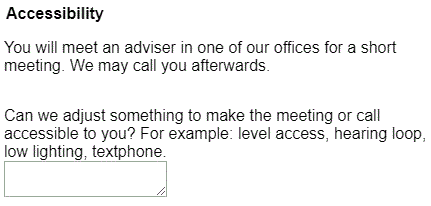
A nice example from this blog is the following:

The question has been reframed to focus more on how the organisation can help the user, not simply prying into some sensitive information.
General Accessibility Issues
Making your form as easy to complete as possible should be your aim, but there are some specific steps you can take to make your forms accessible to those with specific needs. You can find a full write up from us here.
Some further resources
Zuko's comprehensive guide on high impact tips and how to handle common form issues.
https://medium.com/content-at-scope/disability-language-and-service-design-998cc7b5f30a
https://www.miusa.org/resource/tipsheet/assessmentforms
http://garlicjs.org/ Garlic.js allows you to automatically persist your forms' text field values locally, until the form is submitted. This way, your users don't lose any precious data if they accidentally close their tab or browser (for those that may be struggling to fill out your form).
We wrote the book on form optimization!
"The best book on form design ever written - 80 pages of PURE GOLD"


More from our blog:
Want to get started with Zuko?
Start a free trial that includes all features, or request a demo


