Form Data View Guide
The Form Data view provides a topline, birds-eye view of your forms performance and shows you some key metrics as well as a summary of any custom events you are sending to Zuko. Think of it as a ‘page’ level summary of your form.
Visits, Starters, Completions and Abandons over time
This helpful graph presents a breakdown of how many visitors view, start to interact with, and complete your form and how this changes over your selected timeframe. It also shows the number of people that abandon your form after starting it.

Underneath the graph you can see totals for each metrics, along with movement compared with the previous time period. If you are looking at this month’s data, this will show you whether these numbers have risen or fallen when compared to last month. You can also use the Secondary Navigation bar to group data by Hour, Day (default), Week or Month:

See the numbers in detail by hovering over the points on the graph.

You can isolate individual metrics by clicking on those you want to exclude from the graph. Below we can see the number of form completions over time.

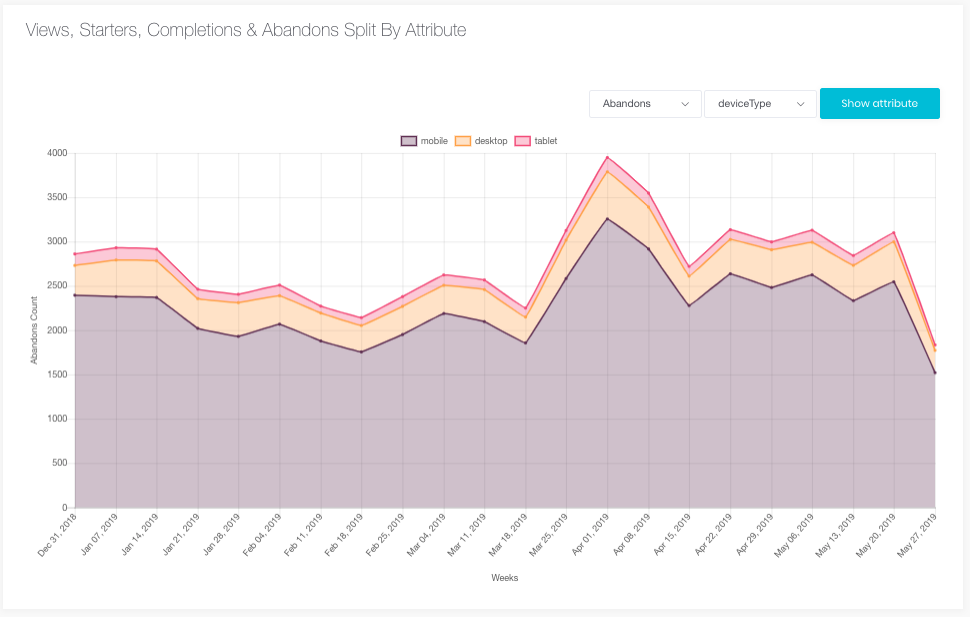
Views, Starters, Completions & Abandons Split By Attribute
This visualisation helps you understand both movements in metrics over time, but also shows the proportion that different segments contribute to that metric over time.

For example in the above we can see Abandons plotted over time for this form, but also see how much each device type contributed to that total. For this form, mobile traffic represents the vast majority of abandons in this form, so perhaps should be a focus for improvement the form.
You can Views, Starters, Completions and Abandons, split out by any Attributes you have set up. For those who haven’t set up any custom attributes you can split data out by Device and Browser, and for those who have set up Custom Attributes, they will appear here.
Rates over time
This graph plots the Views to Starters, Starters to Completions and Views to completions as percentages and shows how these rates change over your selected timeframe.

View to Starter Rate - What % of people who saw the form, started to interact with it?
View to Completion Rate - What % of people who saw the form successfully submitted it?
Starter to Completion Rate - What % of people who started the form successfully submitted it?
You can also isolate individual metrics by clicking on those you want to exclude from the graph.
The average rates for each metric are shown underneath the graph, comparing them to the previous time period.
Median Session Duration Over Time
This shows how long (in seconds) visitors spend in your form before they abandon or complete it.

We can see two segments above - those that abandoned the form and those that completed it. In the above example, it took users an average of 215 seconds to complete the form, and for those that left the form early, they spent an average of 143 seconds in the form before abandoning it.
Average Field Returns Over Time
This graph compares how many times, on average, visitors return to fields during abandoned and completed sessions.

To help explain this metric, let’s consider a visitor who did the following in your form:
- Interacted with Name Field
- Interacted with Email Field
- Interacted with Phone Field
- Went back to Name Field
- Went back to Phone Field
- Abandoned the form
This visitor would have 2 field returns in their session (to Name and Phone) and would be counted in the Abandoned segment.
You can view which fields visitors returned to most often in the Field Aggregate View. This gives you a sense of how many different inputs visitors are returning to throughout the course of their session.
Total Custom Events
See how many custom events occur during the chosen time range in both abandoned and completed sessions.
Custom events can take many forms and include events such as an error message being displayed to a visitor or the point at which a chat widget appears on the screen.
This data will help you identify the occurrence of different events and allow you to examine whether those events happen for everyone, or more often for completed or abandoned sessions.
For example, you might see that the chat widget event happens far more in completed sessions, indicating that it seems to chat widgets helps people complete the form, or you might see an error message that disproportionately occurs in abandoned sessions, suggesting visitors that see that error find it hard to complete the form.
You can see both a visual representation of this data:

As well as a tabular view.
Custom event table

This table gives us a detailed breakdown of the number of times custom events occurred during all sessions, the percentage of sessions these events occurred in and the average number of times the event occurred for each visitor.
For example if we saw the following metrics:
Total Count: 20
% Session Occurred in: 50%
Mean Times Occurred: 2
This would mean that the event occurred 20 times, but in only half of the sessions in this form, and for each of those sessions, it occurred twice.
By selecting Abandoned sessions or Completed sessions at the top of the table we can see how often these events occurred during abandoned and completed sessions and how they compare to each other e.g. is a particular event occurring more times in abandoned sessions than completed sessions.

Want to get started with Zuko?
Start a free trial that includes all features, or request a demo
